The answer depends on where you live and how you choose to travel
A lot of our work at Cambridge Ahead explores how easy it is to travel into and around the Cambridge area. Our research shows that issues
with transport are one of the key factors impacting quality of life locally – the reliability, affordability and accessibility of transport options has a huge impact on our everyday lives, from where we choose to live and work to where we go shopping or how often we see friends.
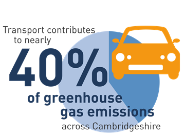
The imperative to travel more sustainably is also an existential one, with transport contributing nearly 40% of greenhouse gas emissions across Cambridgeshire.
Maps that show travel times can help us to understand the actual size of Cambridge, by showing the reasonable commutable area for a particular location.
These maps are not a perfect reflection of actual journey times (see methodology below), but they can give us some insight into why people make the travel choices they do.
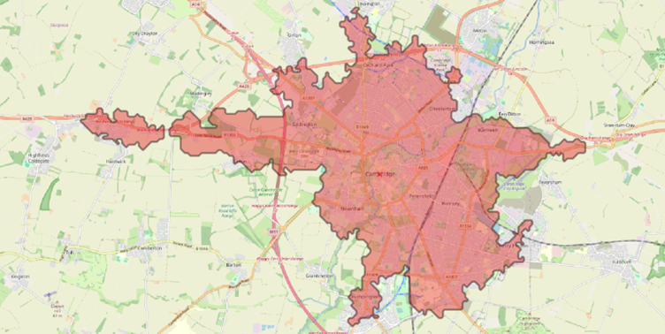
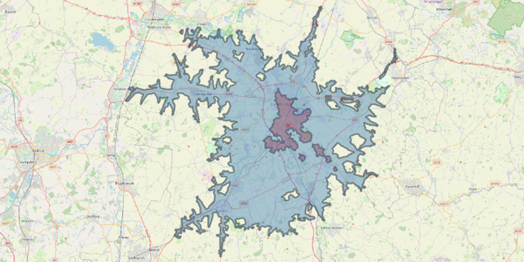
For example, this map shows everywhere within a 35-minute public transport journey (including travel to and between public transport stops/stations) to Cambridge city centre, assuming an arrival time of 9am:
Now compare that to a 35-minute journey to the same location by car:
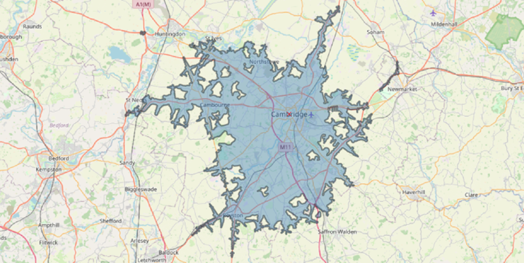
These maps suggest that if you rely on public transport to get around, Cambridge is a much smaller place. If you work in the city centre, your options for where to live are much more limited if you travel by public transport compared to car, and your travel choice is also likely to impact a wide range of other aspects of your life, like where you meet friends and family or do your weekly shop.
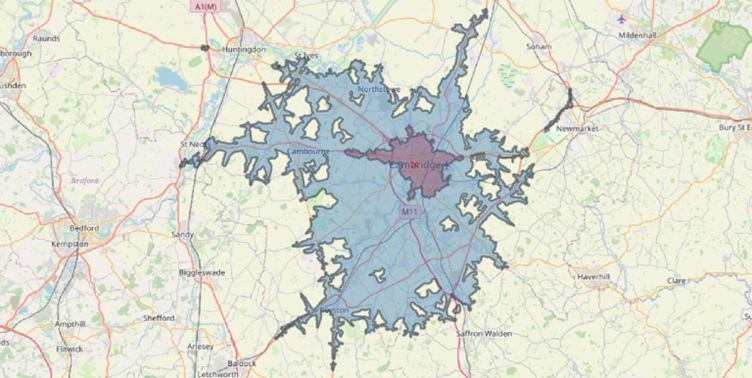
This remains true for a range of locations around the city region. For example, the map below shows the areas within a 35-minute journey of Cambridge Biomedical Campus by public transport (red) and car (blue):
The 2021 Census found that 41% of Cambridge commuters travel by private vehicle, compared to just 9% using public transport, and this split is broadly reflective of previous data. When you look at these maps, it’s clear that driving currently offers you much more choice about where you live, work and spend free time. Cambridge is so much bigger if you travel by car.
Of course, these maps don’t show one significant feature of Cambridge’s transport – the predominance of cycling and walking, facilitated by a growing network of segregated active travel routes. Nearly half of commuters in Cambridge get to work by walking or cycling, and when we consider these modes, we see that active travel opens up a larger area than reliance on public transport alone. Nevertheless, active travel isn’t possible for everyone, and it remains necessary to convert those still using private cars to other less carbon intensive modes, whether it’s walking, cycling or public transport.
To help shift these behaviours, it has to be more convenient to travel by public transport or active travel (and less convenient to drive, which is where things can get controversial). We work on a range of issues related to this required modal shift with partners across the academic, business and civic worlds through the Cambridge Ahead Transport Group.
Things we think would help include:
- Encouraging multimodal journeys by improving the quality of Park and Ride sites around the city centre and supporting ‘last mile’ solutions like e-scooters and e-bikes
- Delivering planned new segregated public transport and active travel schemes, including East West Rail, the Greater Cambridge Partnership’s (GCP) bus corridor and greenways programmes, to provide the necessary infrastructure to support more convenient and sustainable journeys
- Providing real-time data on all public transport to help people make informed decisions
- Introducing further traffic calming measures in the city centre, to reduce congestion and increase the attractiveness of buses by reducing travel times.
This is quite a simplistic analysis, which doesn’t fully take into account other influences on travel behaviour like costs or safety. It also assumes that making public transport faster and more reliable will increase the likelihood of people using it, but research shows that travel behaviours are more complicated than this and influenced by a wide range of different factors.
However, I hope this short analysis does show the scale of the challenge to encourage modal shift in Cambridge – a challenge which will remain significant while Cambridge is so much ‘bigger’ for drivers compared to those using public transport.

Written by Alex Rossiter
Policy Manager, alex@cambridgeahead.co.uk
Methodology
Maps for this blog were created using the TravelTime plugin for QGIS, with an assumed arrival time of 09:00 on a Monday. TravelTime draws data from public transport timetables to produce its models. These also take account of walking times in between public transport stops and arrival/departure windows. Driving times are based on statistical modelling of average driving speeds. These modelling techniques mean that travel time estimations may differ from other platforms and are not able to take account of all scenarios such as cancellations or unexpected delays.
Sources
Maps created using QGIS; TravelTime.
Travel maps showing time, known as ‘isochrone maps’, have been used in lots of interesting ways. I took inspiration from the following articles and blogs for this post:
https://datasciencecampus.ons.gov.uk/access-to-services-using-multimodal-transport-networks/
https://www.tomforth.co.uk/birminghamisasmallcity/
https://www.centreforcities.org/publication/comparing-public-transport-uk-europe-cities/